Sight: Design that Enhances the Visual Enjoyment of Home
In this blog series of designing with our senses in mind, we finally come to sight. Sight is usually the first sense we think of using when it comes to beautiful interiors and exteriors. Which is why I saved it for last. If you missed the other posts about touch, taste, scent, and sound of design you may want to go back and check those out.
We take in so much information with our eyes. In a micro-second we know if a design speaks to us. We know right away if we love it. We also can tell if something is slightly off about a space, even if we can’t immediately pinpoint it. From color to furniture arrangement our first sight of a space makes us want to linger or run away.
So how do you use your sense of sight to enhance your experience of your spaces?
1. Add pops of your favorite color at home
Our attraction to color is primary to our enjoyment of a space. Add pops of your favorite color with flowers, pillows, or artwork. You can also paint walls or furniture depending on how much of that color you want to surround yourself with. Don’t forget to add greenery for calming color and freshness.
Incorporate your favorite color with paint, textiles, art, and furnishings.
2. Create a floor plan that inspires conversation
Consider the arrangement of your furnishings, yes, even in outdoor spaces. Make sure to include furniture groupings that create intimate conversation areas. Some layouts are more conducive to others depending on the shape of a room or area. Rectangular rooms often like furniture with the largest piece of furniture along the longest wall.
Avoid the bowling-alley look in long rooms by creating two separate seating areas back to back. Square rooms are conducive to an L-shape arrangement. Square rooms can also be arranged with the furniture on the diagonal which creates coziness.
Furniture layout matters.
3. Embrace pleasing patterns and shapes
Our eyes like movement and easy transition from one design element to the next. Use pattern and shape to force your eyes to move gently through the space while varying the height of placement throughout the area. Don’t forget to incorporate high areas. If you are designing outside space, trees or outdoor lighting often fill in this upward space. Look all around you to find empty areas and see what shape would fill the space best to keep your eyes moving.
Shape creates movement.
4. Create a focal point that feels meaningful
Does your space have a focal point? If not, create one. Outdoors, this could be anything from a landscaped yard, to a group of planter boxes, to a meandering garden path. Inside this is usually a fireplace or TV. Consider also focusing the room around a beautiful piece of artwork - something from your travels, or that has meaning. Perhaps your perfect focal point is a circular grouping of furniture that allows you to comfortably socialize with your guests so you don’t feel like you have to shout across the room.
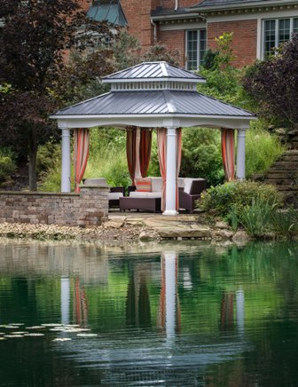
Ponds or water features are great outdoor focal points.
I have many other ideas and design techniques for you if you’d like to schedule a First Impressions Design Session, just click on the button below to work with us.
Until next time,
Monique


